Grid, Canvas, StackPanel containers and Object tag, ApplicationManifest.xaml in Silverlight
In Silverlight, every control is formed with the help of XAML tags. The Grid is predefined container in the XAML which contains all controls. Grid contains the Microsoft designed based on HTML table, depending on the requirement we can create multiple rows & multiple columns in the Grid Container.
Button tag is used to create button control. X:Name property decides Silverlight control Name. In Silverlight every control is an object. Height & Width properties decides control size, Content property using for inputting data.
While deciding events in the XAML tag from the intelligence window, select "New Event" and press "Space Bar".
Object tag:
The Object tag is used to include objects like Images, Audio, Video, Java Applets, ActiveX Controls, PDF files, Flash and Silverlight.
Object tag has several properties to display the Silverlight content.
Data: This property is used to set which type of object is integrating.
Type: By default HTML or browser supports only Text/HTML format data, this format we can convert using MIME type(Multiple Purpose Internet Mail Extension). This property used to convert HTML format into Silverlight.
Param tag: The object tag may have collection of parameters, using this tag we can define one parameter in the object tag.
Param tag contains several properties like Name, Value...etc.
Name: Using this property we can set the parameter name.
Value: Using this parameter we can specify which parameter integrating with the browser. We will give the Silverlight control file .xap path to this property.
In ApplicationManifest.xaml file, Microsoft included predefined logic for integrating with Silverlight plug-in and all runtime execution features.
There are three types of Layouts or Containers in Silverlight. Those are Grid, Canvas and StackPanel.
Grid Container:
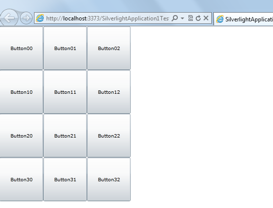
The Silverlight supports default container as Grid. Grid container is used to display the data as collection of Rows and Columns. That means by using the Grid container we can arrange the controls in the multiple rows order and in the column order.
We can arrange the controls in Grid Container as rows and columns as shown below.
<UserControl x:Class="SilverlightApplication1.MainPage"
xmlns="http://schemas.microsoft.com/winfx/2006/xaml/presentation"
xmlns:x="http://schemas.microsoft.com/winfx/2006/xaml"
xmlns:d="http://schemas.microsoft.com/expression/blend/2008"
xmlns:mc="http://schemas.openxmlformats.org/markup-compatibility/2006"
mc:Ignorable="d"
d:DesignHeight="300" d:DesignWidth="400">
<Grid x:Name="LayoutRoot" Background="White">
<Grid.ColumnDefinitions>
<ColumnDefinition Width="100"></ColumnDefinition>
<ColumnDefinition Width="100"></ColumnDefinition>
<ColumnDefinition Width="100"></ColumnDefinition>
</Grid.ColumnDefinitions>
<Grid.RowDefinitions>
<RowDefinition Height="100"></RowDefinition>
<RowDefinition Height="100"></RowDefinition>
<RowDefinition Height="100"></RowDefinition>
<RowDefinition Height="100"></RowDefinition>
</Grid.RowDefinitions>
<Button Content="Button00" Grid.Row="0" Grid.Column="0"></Button>
<Button Content="Button01" Grid.Row="0" Grid.Column="1"></Button>
<Button Content="Button02" Grid.Row="0" Grid.Column="2"></Button>
<Button Content="Button10" Grid.Row="1" Grid.Column="0"></Button>
<Button Content="Button11" Grid.Row="1" Grid.Column="1"></Button>
<Button Content="Button12" Grid.Row="1" Grid.Column="2"></Button>
<Button Content="Button20" Grid.Row="2" Grid.Column="0"></Button>
<Button Content="Button21" Grid.Row="2" Grid.Column="1"></Button>
<Button Content="Button22" Grid.Row="2" Grid.Column="2"></Button>
<Button Content="Button30" Grid.Row="3" Grid.Column="0"></Button>
<Button Content="Button31" Grid.Row="3" Grid.Column="1"></Button>
<Button Content="Button32" Grid.Row="3" Grid.Column="2"></Button>
</Grid>
</UserControl>
Grid.ColumnDefintions tag is used to define multiple columns. In Grid.ColumnDefintions tag, we can define ColumnDefintion tag used to create column and we can mention styles for that column in ColumnDefintion tag.
Grid.RowDefintions tag is used to create multiple rows and by using RowDefintion tag we can create rows. In RowDefintion tag, we can mention styles for particular row.
When we execute the above Silverlight code the output displays as shown below.
Canvas Container:
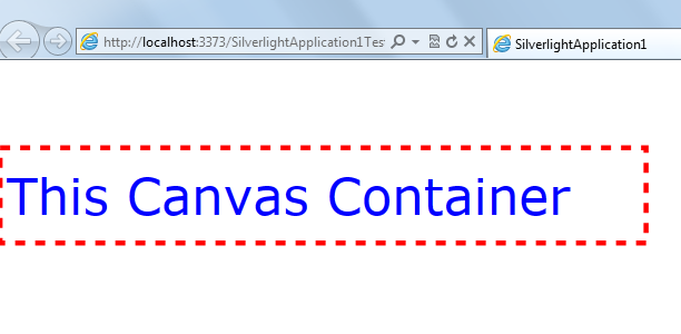
Using the Canvas container we can arrange the collection of controls in the absolute location. We can place the controls in absolute location in Canvas container by using Left & Top properties. Canvas container is useful when working with animations.
We can arrange the Silverlight controls in Canvas container as shown below.
<UserControl x:Class="SilverlightApplication1.MainPage"
xmlns="http://schemas.microsoft.com/winfx/2006/xaml/presentation" xmlns:x=http://schemas.microsoft.com/winfx/2006/xaml"
xmlns:d="http://schemas.microsoft.com/expression/blend/2008"
xmlns:mc="http://schemas.openxmlformats.org/markup-compatibility/2006"
mc:Ignorable="d"
d:DesignHeight="300" d:DesignWidth="400">
<Canvas>
<TextBlock Text="This Canvas Container" Canvas.Left="10" Canvas.Top="100" Foreground="Blue" FontSize="50">
</TextBlock>
<Rectangle Height="100" Width="650" Stroke="Red" StrokeThickness="5" StrokeDashArray="2"
Canvas.Left="1" Canvas.Top="85"></Rectangle>
</Canvas>
</UserControl>
In the above by using Canvas.Left and Canvas.Top properties we are setting the TextBlock control within the Rectangle control. By using the Rectangle tag we can create rectangle; Storke property used to give border color; StrokeThickness property used to give thickness of the border width; StrokeDashArray property used to give border style. The output is as shown below.
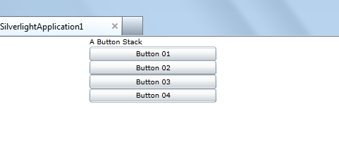
StackPanel Container:
StackPanel is used to arrange its children in a single row or column and the child elements are arranged based on their order. Generally StackPanel will arrange the elements from top to bottom by default as shown below.
<UserControl x:Class="SilverlightApplication1.MainPage"
xmlns="http://schemas.microsoft.com/winfx/2006/xaml/presentation"
xmlns:x="http://schemas.microsoft.com/winfx/2006/xaml"
xmlns:d="http://schemas.microsoft.com/expression/blend/2008"
xmlns:mc="http://schemas.openxmlformats.org/markup-compatibility/2006"
mc:Ignorable="d" d:DesignHeight="300" d:DesignWidth="400">
<StackPanel Background="White">
<TextBlock Text="A Button Stack"></TextBlock>
<Button Content="Button 01"></Button>
<Button Content="Button 02"></Button>
<Button Content="Button 03"></Button>
<Button Content="Button 04"></Button>
</StackPanel>
</UserControl>
If you execute the above StackPanel code, the output as shown below.