StackPanel in WPF
StakPanel is one of the important panel in WPF, it is widely used control and simple to use. Arranging the elements in StackPanel is very simple, just we have to place the elements in sequential order. StackPanel doesn’t have any attached properties and it has Orientation property to place the elements. Orientation property is of System.Windows.Controls.Orientation type and has two values Horizontal & Vertical. With the Horizontal value elements arranged horizontally and with Vertical elements arranged vertically, the default value for Orientation is Vertical. Let’s discuss with StackPanel with simple example.
Open Microsoft Visual Studio 2013 and create WPF application. Change the MainWindow.xaml as shown below.
<Window x:Class="WPFStackPanel.MainWindow"
xmlns="http://schemas.microsoft.com/winfx/2006/xaml/presentation"
xmlns:x="http://schemas.microsoft.com/winfx/2006/xaml"
Title="MainWindow" Height="350" Width="525">
<StackPanel>
<Button Background="Red" Height="50" Width="300">Red</Button>
<Button Background="Green" Height="50" Width="300">Green</Button>
<Button Background="Yellow" Height="50" Width="300">Yellow</Button>
<Button Background="Black" Height="50" Width="300">Black</Button>
<Button Background="Blue" Height="50" Width="300">Blue</Button>
<Button Background="Brown" Height="50" Width="300">Brown</Button>
</StackPanel>
</Window>
As shown above we placed the six buttons with different background in stack panel and we didn’t set the Orientation property, so elements arranged with default property Vertical. Run the application and the output display as below.
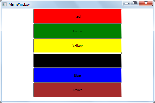
As shown above elements arranged vertically because StackPanel using Orientation default value Vertical. Now change the code as shown below to use Orientation as Horizontal.
<Window x:Class="WPFStackPanel.MainWindow"
xmlns="http://schemas.microsoft.com/winfx/2006/xaml/presentation"
xmlns:x="http://schemas.microsoft.com/winfx/2006/xaml"
Title="MainWindow" Height="350" Width="525">
<StackPanel Orientation="Horizontal">
<Button Background="Red" Height="50" Width="75">Red</Button>
<Button Background="Green" Height="50" Width="75">Green</Button>
<Button Background="Yellow" Height="50" Width="75">Yellow</Button>
<Button Background="Black" Height="50" Width="75">Black</Button>
<Button Background="Blue" Height="50" Width="75">Blue</Button>
<Button Background="Brown" Height="50" Width="75">Brown</Button>
</StackPanel>
</Window>
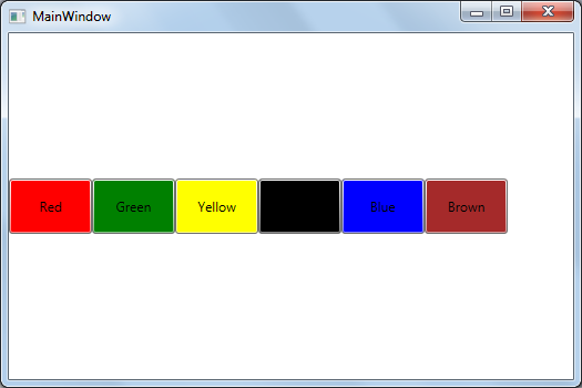
In the above code we provided the Orientation value as Horizontal that means elements will arrange horizontally as shown below.
We can set the LayoutTransform in the StackPanel to apply some transform as shown below.
<Window x:Class="WPFStackPanel.MainWindow"
xmlns="http://schemas.microsoft.com/winfx/2006/xaml/presentation"
xmlns:x="http://schemas.microsoft.com/winfx/2006/xaml"
Title="MainWindow" Height="350" Width="525">
<StackPanel Orientation="Horizontal">
<Button Background="Red" Height="50" Width="100">Red</Button>
<Button Background="Green" Height="50" Width="100">Green</Button>
<Button Background="Yellow" Height="50" Width="100">
<Button.LayoutTransform>
<RotateTransform Angle="50"></RotateTransform>
</Button.LayoutTransform>
Yellow
</Button>
<Button Background="Black" Height="50" Width="100">Black</Button>
<Button Background="Blue" Height="50" Width="100">Blue</Button>
<Button Background="Brown" Height="50" Width="100">Brown</Button>
</StackPanel>
</Window>
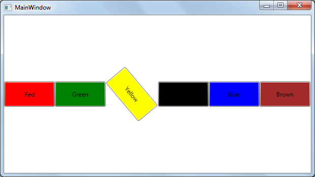
As shown in the code we set the LayoutTransform for Yellow button with the 50 angle, run the application and the output displays as shown below with Yellow button in 50 degrees angle.
Even we can apply the RenderTransform also for StackPanel elements as shown below.
<Window x:Class="WPFStackPanel.MainWindow"
xmlns="http://schemas.microsoft.com/winfx/2006/xaml/presentation"
xmlns:x="http://schemas.microsoft.com/winfx/2006/xaml"
Title="MainWindow" Height="350" Width="525">
<StackPanel Orientation="Horizontal">
<Button Background="Red" Height="50" Width="100">Red</Button>
<Button Background="Green" Height="50" Width="100">Green</Button>
<Button Background="Yellow" Height="50" Width="100">
<Button.RenderTransform>
<RotateTransform Angle="50"></RotateTransform>
</Button.RenderTransform>
Yellow
</Button>
<Button Background="Black" Height="50" Width="100">Black</Button>
<Button Background="Blue" Height="50" Width="100">Blue</Button>
<Button Background="Brown" Height="50" Width="100">Brown</Button>
</StackPanel>
</Window>
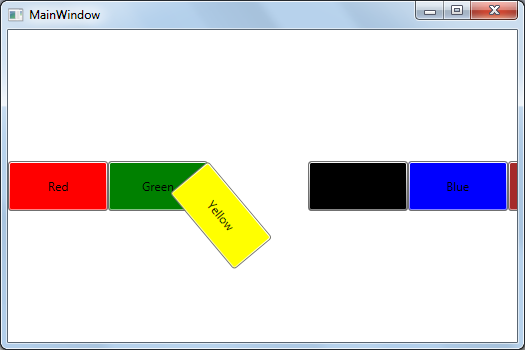
Here we apply the RenderTransform for Yellow button. Run the application, the out display as shown below.
We applied the LayoutTransform & RenderTransform for StackPanel elements with Orientation as Horizontal, we can apply same for Orientation as Vertical also.
We can use the Margin for the StackPanel elements to control the space between StackPanel edge and elements, between StackPanel elements.